
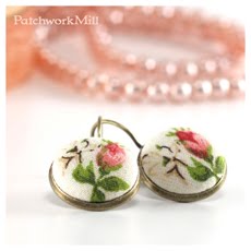
Well we got it now, at least here in Hungary we did. The sun is shining so hard, the lights are so sharp that I spent the whole last week trying to take pictures of my new stuff but every single shot I grab of them give back catastrophic results. Truth be said, the colors of the nature are sharper, the green is greener so that is also part of the reason why I got into such a greeny mood.
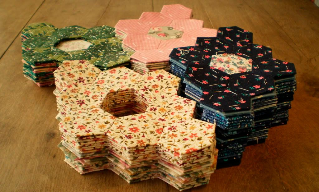
 The creators are all members of the European Street Team on Etsy:
blathdesigns
MGMart
ClareBears
vadjutka
MGMart
ClareBears
vadjutka
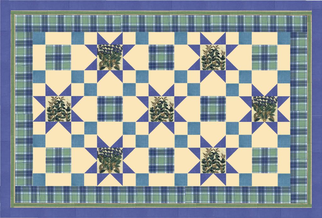
Finally I had success with the photographing today: the sky got filled with cloud (indeed it seemed that there would be a storm) and even though they were gone by nighttime I could take some pretty good pictures. They finally give back the original colors of my new camera case that was made from one of my favorite fabric.
 This beautiful Blue Hydrangea fabric was the summer tablecloth of my Grandma. As I was sewing this camera case (and previously a fabric cover for a notebook) I was constantly reminded of the wonderful summer family mealtimes. Maybe that is the point of vintage and recycling: to save and share.
I took a picture of the notebook together with the new camera case, I think they are looking great together.
 Here are my "photomodels" – waiting patiently.
 I took a picture of our strawberry field as well which also looks sparkling green (as we ate all the red strawberries yesterday). ☺
 And finally some buttons for my Green Monday Moodboard:


